

Weather maps are visual tools that display atmospheric conditions—including pressure systems, temperature, precipitation, and fronts—across a geographic area. Learning to read them involves understanding symbols, isobars, color scales, and meteorological notation. This guide covers everything from basic map types to advanced reading techniques used by forecasters.
Weather has shaped human civilization for millennia. From farming decisions to military campaigns, the ability to anticipate atmospheric change has always carried enormous practical value. Today, weather maps sit at the center of modern meteorological science, translating complex atmospheric data into visual formats that both professionals and everyday readers can interpret.
Despite their ubiquity—on news broadcasts, weather apps, and government meteorological websites—most people lack a working understanding of what weather maps actually show. The symbols, colors, lines, and annotations that populate these maps carry precise scientific meaning. Misreading them can lead to poor planning decisions; understanding them opens up a deeper awareness of how the atmosphere behaves.
This article provides a thorough, structured introduction to weather maps: what they are, the different types in common use, the symbols and notation systems meteorologists rely on, and practical strategies for reading them accurately. Whether you encounter a surface analysis chart on a national weather service website or a satellite image on your phone, this guide equips you to extract meaningful information from it.
The Role of Weather Maps in Meteorology
Weather maps—also called synoptic charts—are graphical representations of atmospheric conditions at a specific time and location. The word “synoptic” comes from the Greek synoptikos, meaning “seen together,” reflecting the maps’ function of presenting broad weather conditions across wide geographic regions in a single view.
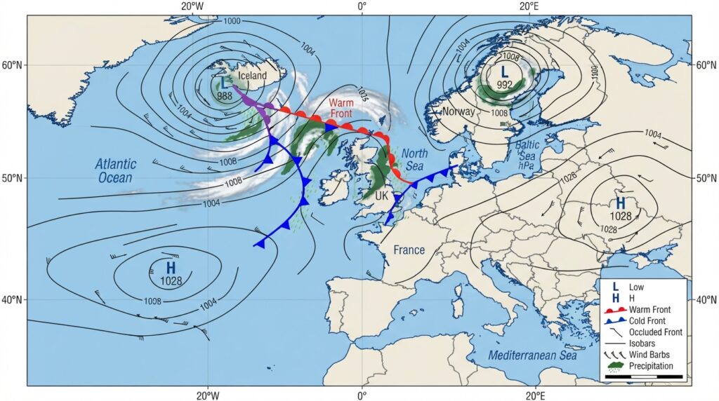
Meteorologists use weather maps to identify patterns, track the movement of air masses, and generate forecasts. When read in sequence over time, a series of weather maps reveals how systems develop, intensify, and dissipate. This temporal dimension is critical to accurate forecasting.
The World Meteorological Organization (WMO), a specialized agency of the United Nations, establishes international standards for weather map notation and data exchange. This standardization ensures that a meteorologist in Tokyo can read a synoptic chart produced in Paris without confusion—a crucial feature given that atmospheric systems move across national boundaries without regard for political geography.
Major Types of Weather Maps
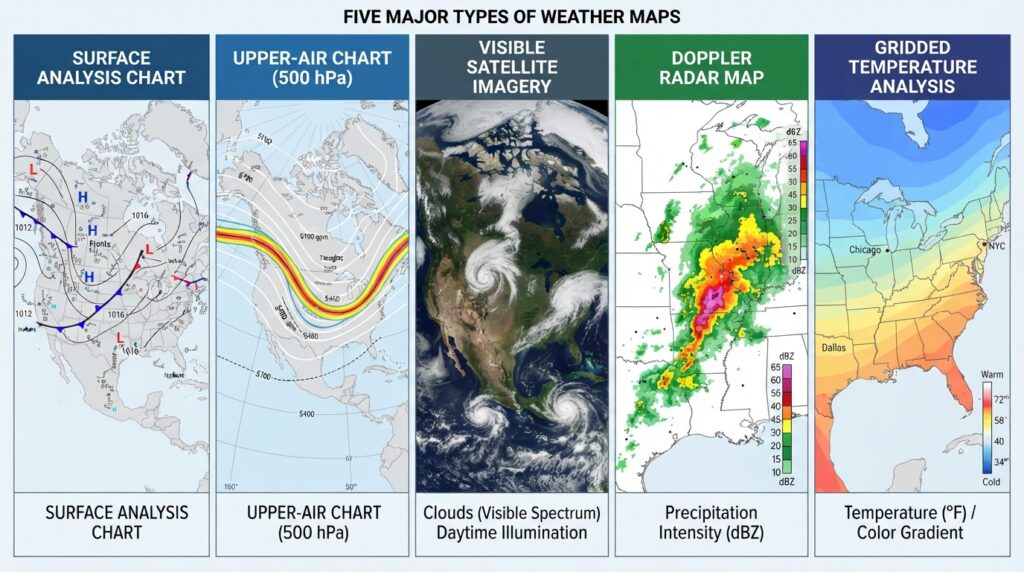
Weather maps are not a single, uniform category. Several distinct types serve different analytical purposes, and understanding what each one shows is foundational to reading them correctly.
Surface Analysis Charts
Surface analysis charts depict atmospheric conditions at or near ground level. They display pressure systems, weather fronts, wind patterns, and precipitation areas. This is the most commonly encountered weather map type in public forecasting and news media.
Surface charts are constructed using data collected from weather stations, buoys, weather balloons, and automated sensors. These data points are plotted on the map and then interpolated to create the contour lines and annotated symbols that define the chart’s visual structure.
Upper-Air Charts
Upper-air charts, sometimes called upper-level or upper-atmosphere charts, represent conditions at specific altitudes above the surface—commonly at pressure levels of 500 millibars or 300 millibars. These altitudes roughly correspond to the mid-troposphere and near the tropopause, respectively.
Upper-air charts are essential for understanding the movement of jet streams, the development of large-scale storm systems, and the steering mechanisms that drive surface weather patterns. A trough of low pressure visible on an upper-air chart, for example, often corresponds to stormy conditions at the surface below it.
Satellite Imagery Maps
Satellite imagery translates data captured by orbiting satellites into visual maps. There are three primary types: visible imagery (which shows reflected sunlight, making it most useful during daylight hours), infrared imagery (which measures temperature differences and works around the clock), and water vapor imagery (which tracks moisture distribution in the mid-to-upper atmosphere).
Infrared satellite maps are particularly valuable for identifying cloud-top temperatures and, by extension, the height and intensity of storm systems. Deep convective storms, such as thunderstorm complexes, appear as bright white regions on infrared imagery due to the extreme cold temperatures at their cloud tops.
Radar Maps
Radar weather maps use radio wave technology to detect precipitation—its location, intensity, and movement. The term RADAR stands for Radio Detection and Ranging. Doppler radar, the standard in modern meteorological networks, adds the ability to measure the velocity of precipitation particles, enabling forecasters to detect wind rotation within storms.
Radar maps display precipitation intensity using color scales. In most national systems, colors progress from light green (light rain) through yellow and orange (moderate rain) to red and purple (heavy rain or hail), with the most intense reflectivity values often indicating severe thunderstorm cores.
Precipitation and Temperature Maps
Gridded analysis maps display forecast or observed values of specific variables—precipitation totals, temperature anomalies, or snowfall accumulation—across a region using color gradients. These maps are commonly used in climate analysis, seasonal outlooks, and public weather communication.
Core Symbols and Notation on Weather Maps
The symbols used on weather maps follow internationally standardized conventions. Familiarity with these symbols is the most direct path to reading weather maps with confidence.
Isobars and Pressure Systems
Isobars are lines connecting points of equal atmospheric pressure, measured in millibars (mb) or hectopascals (hPa)—equivalent units. On surface analysis charts, isobars reveal the location and intensity of high-pressure and low-pressure systems.
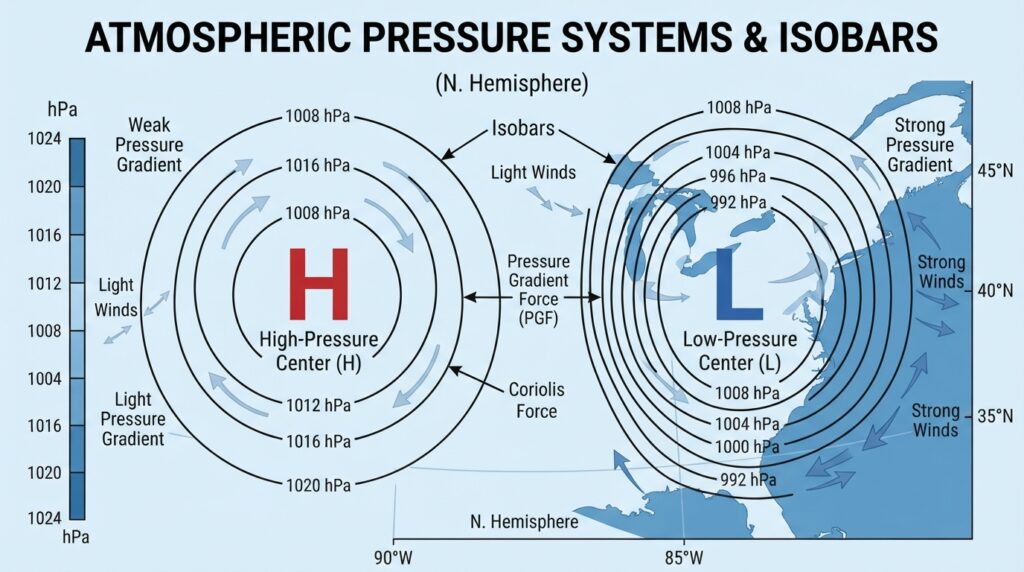
High-pressure systems (marked with “H”) are associated with descending air, generally stable conditions, and clear skies. Air circulates clockwise around high-pressure centers in the Northern Hemisphere and counterclockwise in the Southern Hemisphere.
Low-pressure systems (marked with “L”) feature rising air, increased cloud formation, and precipitation potential. Air flows counterclockwise into low-pressure centers in the Northern Hemisphere. The closer together the isobars appear on a chart, the steeper the pressure gradient—and the stronger the resulting winds.
Weather Fronts
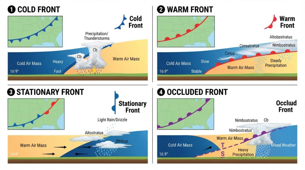
Fronts mark the boundaries between air masses of differing temperature, humidity, and density. They are among the most consequential features on a surface analysis chart.
- Cold fronts are depicted with blue lines featuring filled triangles pointing in the direction of frontal movement. Cold fronts occur where advancing cold air displaces warmer air, often producing a narrow but intense band of precipitation and gusty winds.
- Warm fronts are shown as red lines with semi-circles pointing toward the direction of movement. As warm air rides up over retreating cold air, warm fronts typically produce extended periods of cloud cover and steady precipitation ahead of the front’s surface position.
- Stationary fronts appear as alternating blue triangles and red semi-circles, indicating a frontal boundary that is neither advancing nor retreating significantly. These fronts can produce prolonged precipitation over a fixed geographic area.
- Occluded fronts are drawn with purple lines featuring alternating triangles and semi-circles on the same side. Occlusion occurs when a faster-moving cold front catches up to a warm front, lifting the warm air sector off the surface entirely.
Station Models
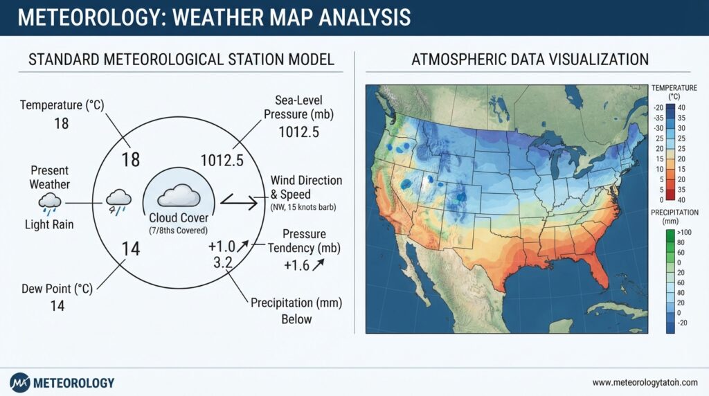
At individual weather observation points on surface analysis charts, meteorologists plot a compact data display called a station model. This small circle with surrounding annotations encodes a significant amount of information, including current temperature, dew point temperature, wind speed and direction, cloud cover, sea-level pressure, and present weather conditions.
Wind direction is shown by a line (staff) extending from the station circle, indicating the direction from which the wind is blowing. Wind speed is conveyed through barbs attached to the staff: a short barb equals 5 knots, a long barb equals 10 knots, and a filled triangle (pennant) equals 50 knots.
Color Scales on Gridded Maps
Gridded forecast maps use color gradients to convey numerical values across a spatial field. Conventions vary by issuing agency, but in most systems warmer colors (reds, oranges) represent higher values—warmer temperatures, heavier precipitation—while cooler colors (blues, purples) represent lower values. Always check the map’s legend before interpreting color patterns, as scales differ across agencies and products.
How to Read a Weather Map Step by Step
Reading a weather map accurately requires a structured approach. Atmospheric features interact with one another, and a systematic method prevents misinterpretation.
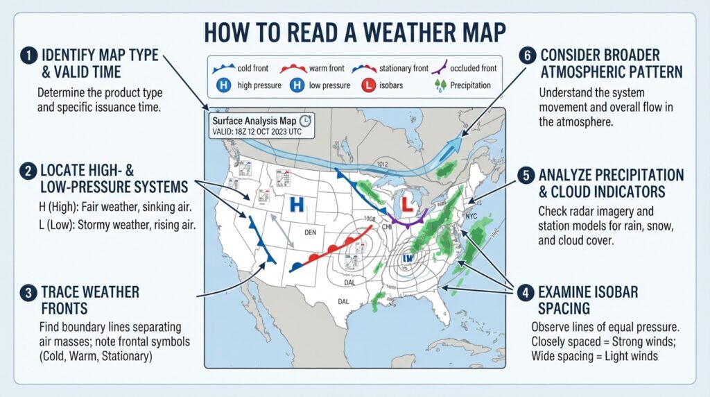
Step 1: Identify the map type and valid time. Every weather map should carry a timestamp indicating when the data was observed or when the forecast is valid. Confirm the map type—surface analysis, upper-air chart, radar, or satellite—before beginning analysis.
Step 2: Locate pressure systems. Find all marked high- and low-pressure centers. Note their geographic position and approximate central pressure. Low-pressure systems are generally the most active weather producers and warrant early attention.
Step 3: Trace the fronts. Identify all frontal boundaries and determine their type and direction of movement. Weather conditions differ significantly ahead of, along, and behind each frontal type.
Step 4: Examine the isobar spacing. Closely spaced isobars indicate strong winds. Note areas where isobars are tightest, as these correspond to regions of highest wind activity.
Step 5: Read precipitation and cloud indicators. On surface charts, station models and shaded regions mark precipitation areas. On radar maps, interpret color intensity using the product’s scale. On satellite imagery, identify cloud formations by their texture and brightness.
Step 6: Consider the broader pattern. No single weather feature exists in isolation. A low-pressure system is steered by upper-level flow; a cold front’s intensity is shaped by the temperature contrast across it. Step back and consider how the features you’ve identified relate to one another spatially and dynamically.
Common Misinterpretations and How to Avoid Them
Several misreading recur among those new to weather map interpretation.
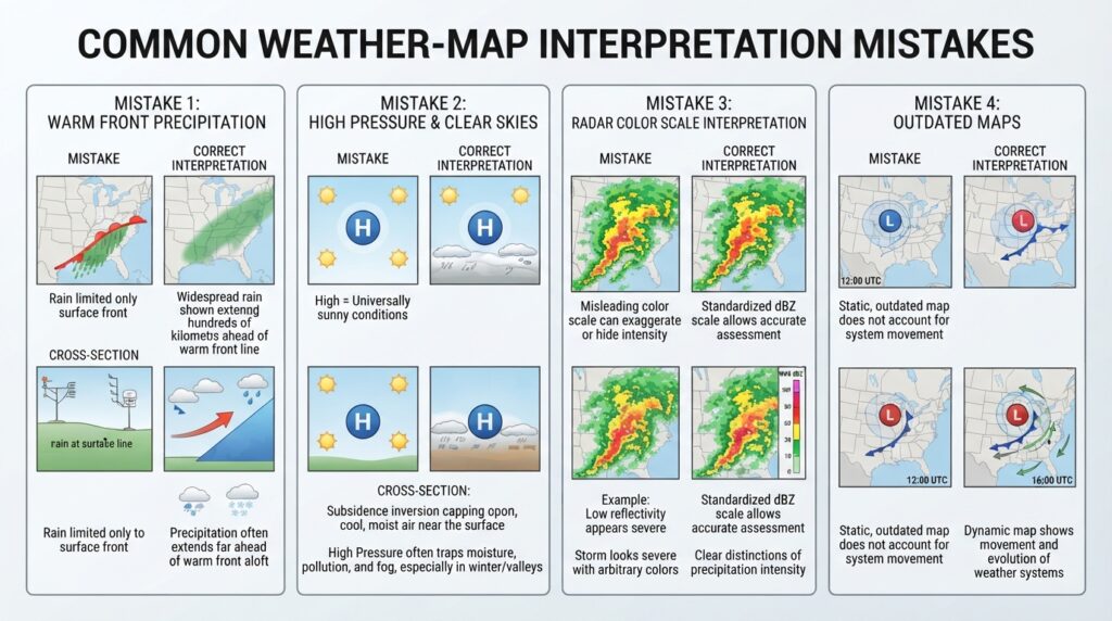
Confusing the surface position of a front with precipitation location is a frequent error. Precipitation associated with a warm front often extends hundreds of kilometers ahead of the front’s surface position, while precipitation behind a cold front may persist well after the front passes. Understanding the three-dimensional structure of frontal systems prevents this mistake.
Assuming high pressure always means good weather oversimplifies a complex relationship. While high pressure generally suppresses precipitation, it can also trap pollutants near the surface, produce fog in humid conditions, and generate intense heat during summer months.
Misreading radar intensity scales is another common issue. Different radar products use different scales; the color red on one platform may indicate moderate rain, while on another it signals severe convection. Checking the legend every time—rather than assuming a familiar scale—is essential practice.
Ignoring the timestamp leads to significant errors. A surface analysis chart from six hours ago may bear little resemblance to current conditions if an active weather system is moving rapidly. Always verify the valid time of any map before drawing conclusions.
Weather Maps as a Practical Skill
Reading weather maps is not solely the domain of professional meteorologists. Pilots, mariners, emergency managers, outdoor recreation professionals, and farmers all rely on synoptic chart interpretation to make time-sensitive decisions. Aviation weather briefings, for example, center on the analysis of surface charts, winds-aloft charts, and significant weather (SIGWX) charts that pilots must interpret competently before each flight.
Governments and national meteorological agencies—including the National Weather Service (NWS) in the United States, the Met Office in the United Kingdom, and the Bureau of Meteorology (BOM) in Australia—publish real-time weather maps and analysis products freely online. Regular engagement with these resources, combined with comparing charts to actual observed conditions, accelerates practical skill development considerably.
Building Proficiency Through Practice
Theoretical knowledge of weather map symbols and conventions is necessary but not sufficient. Proficiency comes from repeated exposure to real maps under varying atmospheric conditions.
A practical approach to skill-building involves the daily habit of comparing forecast maps to observed outcomes. Retrieve a surface analysis chart each morning, record your interpretation of expected conditions, then compare your expectations to what actually occurred by the following day. Over time, this feedback loop sharpens pattern recognition and deepens understanding of how different atmospheric configurations translate into surface weather.
Many national weather agencies offer archived map libraries, enabling learners to study historical weather events—major hurricanes, significant snowstorms, notable heat waves—and trace their development through sequential synoptic charts. This retrospective analysis is among the most effective methods for building meteorological literacy.
Online communities, university meteorology departments, and public education programs offered by agencies such as NOAA (National Oceanic and Atmospheric Administration) provide supplementary resources for those seeking deeper engagement with weather science.
The Value of Meteorological Literacy
Weather maps distill vast quantities of atmospheric data into a format that, once understood, conveys a remarkable amount of information at a glance. Isobars, fronts, station models, and color gradients are not arbitrary—each element carries precise scientific meaning derived from decades of observational science and international standardization.
The ability to read a weather map accurately transforms a passive consumer of forecast information into an active interpreter. Rather than accepting a single forecast at face value, a map-literate reader can assess the confidence level of a forecast, understand the meteorological reasoning behind it, and make better-informed decisions as a result.
Atmospheric science continues to advance, with higher-resolution numerical models, improved satellite instruments, and expanded radar networks steadily enhancing the quality and precision of weather maps. The foundational literacy developed through systematic study of current map conventions, however, remains the essential gateway to understanding and applying these increasingly sophisticated tools.